As I fling myself backward into a blue sea of plastic balls, I wonder: What color would you really call them? Robin’s egg? Pale cerulean? Perhaps light turquoise, but that might suggest more green than is truly present.
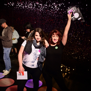
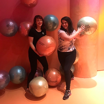
It’s the summer of 2019, and I’m at a place called Color Factory – part art installation, part interactive museum – with Drive’s senior art director, Leanna Schmidt, swimming in a monochromatic ball pit and mulling over the very idea of color.
When we arrived, we each chose buttons to wear – mine was heliotrope, described as “a shrub with cherry-pie scented purple blooms” that had been “immensely fashionable” in the 1880s. We sample colorful snacks (macarons in mauve, gummy fish in dandelion), dance on a light-up floor and spin on life-sized color wheels.

Along the way, we see and learn about hundreds of colors, and I realize that I know very little about something I’m surrounded by every day. “The thing that is omnipresent in people’s lives that they know the least about is color,” says Stephen Farthing, co-author of On Color, a book about the history, science and cultural context of color.
Speaking over Skype from his home in Jordan, Farthing explains that color can affect our mood. Color can unconsciously shape our decisions. Color can play a part in the first impression we make on a job interview or date.
I decide to learn everything I can about color and whether, as Farthing and his co-author David Scott Kastan posit, it can help me appreciate the world on a deeper level.
The Science of the Rainbow
As I wade through the ball pit, contemplating whether you might even call the plastic orbs a bluish gray, my thoughts shift to my dad, who was colorblind.
He worked for years as a UPS truck loader before he found out the trucks and uniforms were brown (they looked green to him) and needed shopping helpers lest he inadvertently end up in a pink business shirt (he was not a man who could pull off pink). He always played the yellow pieces in Parcheesi because yellow was the color he could most easily distinguish.
I could never wrap my mind around how he knew that what he was seeing wasn’t the same color that other people saw. “I know what red is,” he would try to explain. “I just didn’t know that stop signs were red until someone told me. They look kind of brown to me.”
“But how do you KNOW what red is?” I would persist.
“I don’t know,” he said. “Some things that are red look red to me. Some things that other people tell me are red don’t look red.”
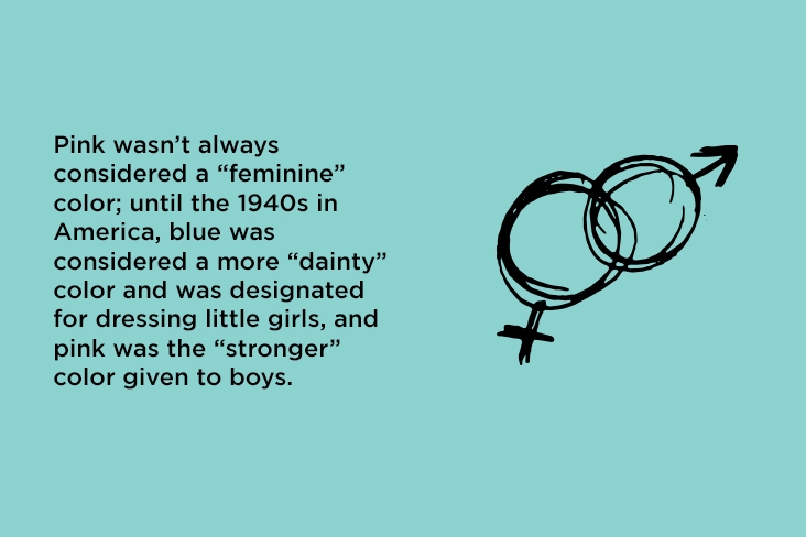
I later learned that the range of shades my dad’s eyes could pick up was just more limited than the range my eyes could detect. To me, the idea of red was a given: Red is the color of fire extinguishers and roses and the house I grew up in – all slightly different, but obviously red. My dad couldn’t discern the gradations. Looking at a McIntosh apple, he saw what I saw, more or less – but the color of our house, a faded rust, was murkier. To my dad, it looked tan.
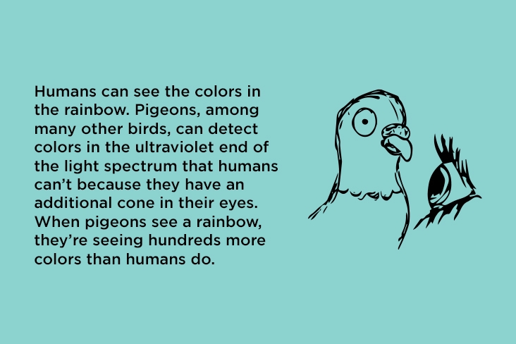
There are actually infinite shades of red, and no human can see them all. In fact, since the 17th century, people have debated whether colors “really, physically exist” or exist only in the mind, writes Kassia St. Clair in her book The Secret Lives of Color. That’s because what we see as color is the light that’s reflected off the surface of an object and into our eyes, where it’s processed by the cones in our retinas.
Farthing tells me to consider the rainbow – an arc of colors created by the interaction of sunlight and water droplets. If you were close enough to reach out and touch the stripes, your hand would find nothing but air. “The rainbow is not a physical object,” Farthing says. “Rainbows exist in our head.”
In On Color, Farthing and Kastan presuppose that it’s impossible to fully understand something that exists far beyond what humans can perceive, but we can learn about how color affects us and the world around us.
Color Theory for Everyday Life
Farthing is a painter, so he’s intimately acquainted with the power of color to evoke emotion. Our perception of color changes based on what other colors are present, he says, an idea pioneered by artist Josef Albers.
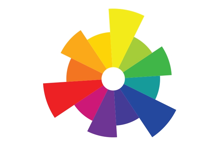
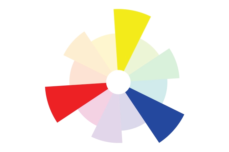
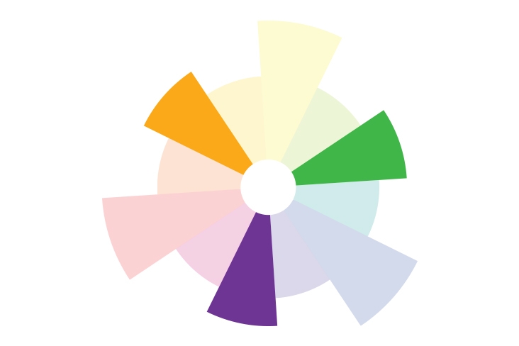
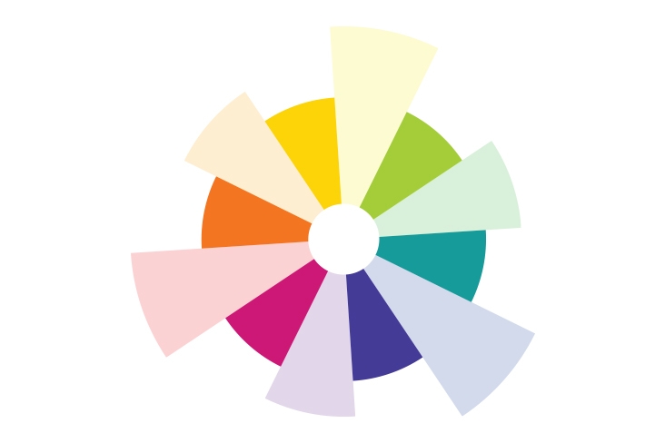
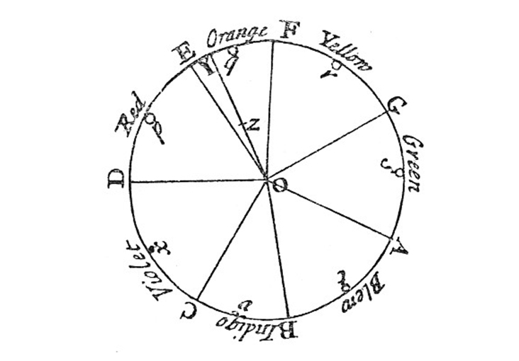
Colors on the opposite sides of the color wheel (see “The Color Wheel” sidebar below) are complementary, providing high contrast, whereas colors closer together, like yellow and orange, are harder to distinguish when placed together. Farthing explains that you can see this when, for example, a fashion designer makes a coat in both mustard yellow and cornflower blue so that each color stands out on a display.
The relative amount of different colors also matters – a small amount of red on a white background makes the red stand out. Understanding these principles can help us make better choices: Do you want to blend in with the crowd at a professional event or make sure that everyone will notice you when you enter the room? If you don’t want everything in your house to match, what color rug will coordinate, rather than clash, with your bedspread and create a more pleasant environment?
Then there are cultural associations to consider. “We easily associate color with people, things, brands,” Farthing says. “There’s a deep emotional side to it, like music.”
Target stores have cultivated a strong connection with the color red; so has Coca-Cola®. Orange may call to mind construction cones, safety vests – and Home Depot. The combo of red, white and blue symbolizes patriotism to Americans – as it does in Thailand, France and 26 other countries with the same colors on their flags. Blue and orange complement each other, but if you’re not a Chicago Bears fan, you probably don’t want that color scheme in your bedroom.
Many studies have shown that colors have deep-seated psychological resonance. Sally Augustin, an environmental psychologist who advises on color in home and product design, believes this could be traced back to evolutionary purposes.
Red has been shown to give a burst of adrenaline, which could be connected to an early human fight-or-flight response to seeing blood. Andrew Elliot, a professor of psychology at the University of Rochester, has conducted research on the psychological effect of the color red and has found that red can heighten aggression and hinder cognitive function.
“Red enhances our physical reactions because it is seen as a danger cue,” Elliot says. “Humans flush when they are angry or preparing for attack. People are acutely aware of such reddening in others and its implications.”
Green, on the other hand, can be calming and boost creativity due to its tie to nature. A 2015 study by Kate Lee, a research fellow in the School of Ecosystem & Forest Sciences at the University of Melbourne, found that viewing images of green rooftops for a mere 40 seconds can markedly improve concentration.
Surveys dating from the mid-20th century have consistently shown blue as the most popular color. In 2010, psychologists Stephen E. Palmer and Karen B. Schloss published a paper on their research which showed that people develop preferences for colors based on how they feel about things associated with them.
For example, someone who relishes the flavor of lemons may love yellow, but someone who dreaded riding the big yellow school bus as a kid may hate the color. Blue, the hue of a clear sky or body of water (or the Subaru star cluster logo!), is almost universally beloved. “It turns out, if you look at all of the things that are associated with blue, they’re mostly positive,” Schloss told the art world website Artsy in 2017. “It’s really hard to think of negative blue things.”
How does that apply to our everyday world? Red may be a good color for a sports team but not for an office or classroom. If you’re trying to sell your house, consider painting the walls a shade of blue – it’s unlikely to repel potential buyers.
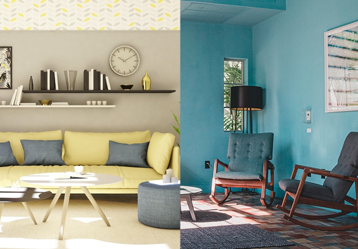
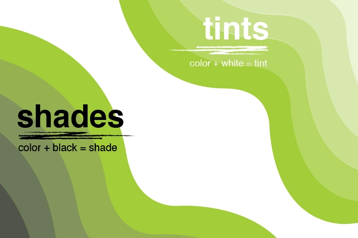
Saturation and brightness are two other factors that affect how we react to color. Augustin describes saturation as “how true a color is to the ideal of that color.” Kelly green is more saturated than sage green, for example.
Brightness refers to how much white is contained in a color, so a pale pink is technically brighter than a bold magenta pink. Both “determine your emotional response to a space,” Augustin says. Colors that are not very saturated but are relatively bright – a light sage green, for example – tend to relax us. Plus, lighter colors can make a space feel bigger. Cooler colors – those closest to blue on the color wheel – can make people feel cooler in body temperature and vice versa for warm colors.
What’s the Best Color?
“There are no bad or good colors,” says Lynne Levin, an artist and faculty member at Parsons School of Design in New York City. I want Levin to explain the vital importance of understanding color theory, but she insists that everyone, artists included, should simply observe the world around them and pay attention to what they like.
“No one can tell you what your colors are,” Levin says. “If you like to wear beige, you wear beige.” Of course, that begs the question of how we pick the colors we like.
I try to pay more attention to my own color choices. I realize that purple eyeshadow makes my brown eyes stand out better than shimmery pink, and I feel like a makeup genius! I see how new throw pillows with waves of deep turquoise and gold complement my ink-blue couch better than the old ones of a duller, grayer blue, and how it makes the whole room feel pulled together and cozy. I notice that during walks with my dog, Arthur, he gets more attention from strangers when he wears his snappy Pendleton® coat featuring rust, orange and gold stripes on a navy background, standing in contrast to his tawny fur.
Color is so ubiquitous that we often forget to take note of it; it’s also one of the most fascinating and mysterious elements of our universe. My goal to learn everything I could about color turned out to be as delightfully impossible as the color spectrum is vast, but it was the wrong goal anyway – being curious about color is all that’s required for it to make a difference in your life.
— Josef Albers, Interaction of Color
